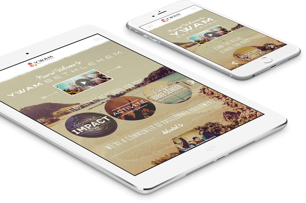
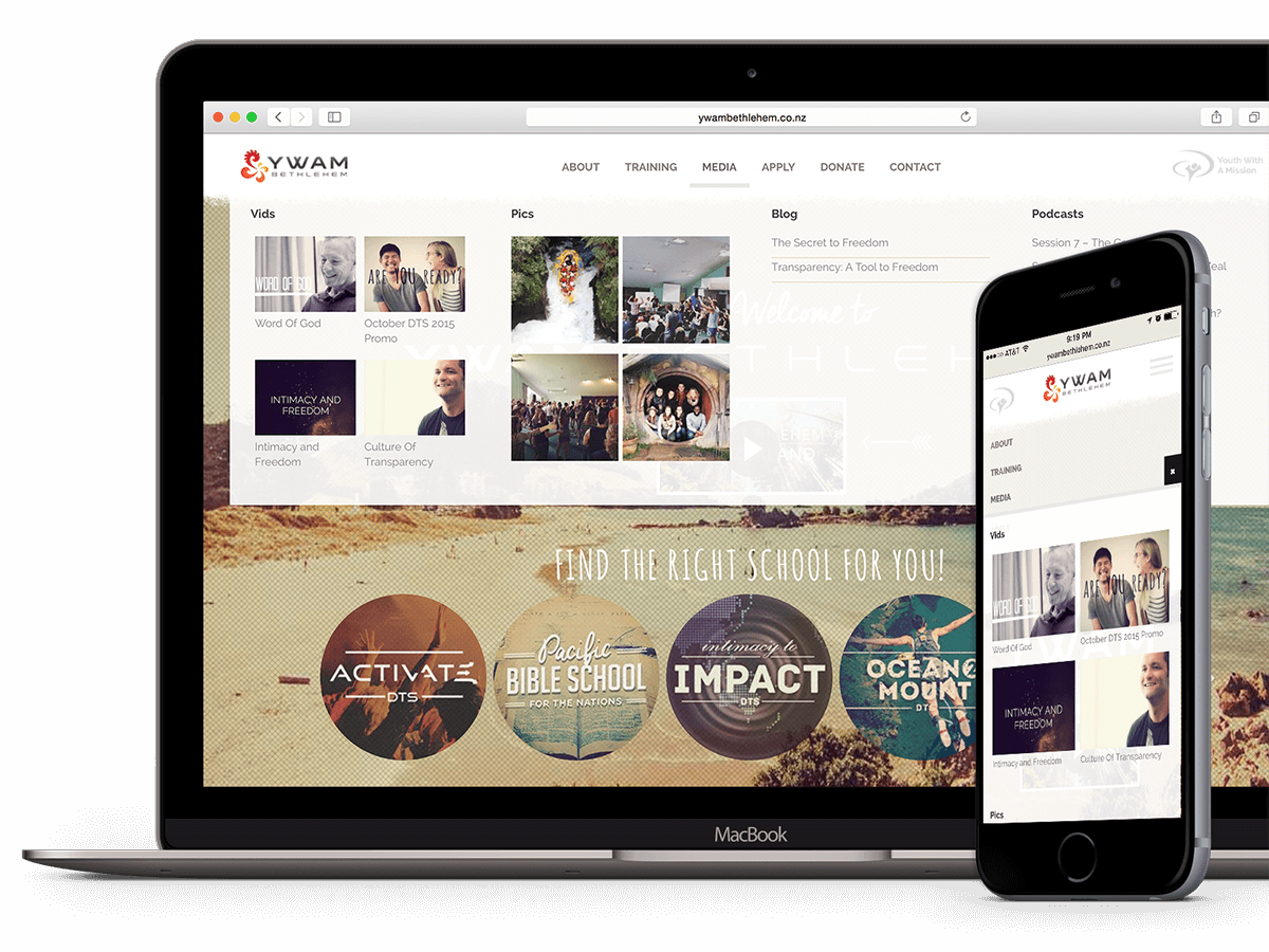
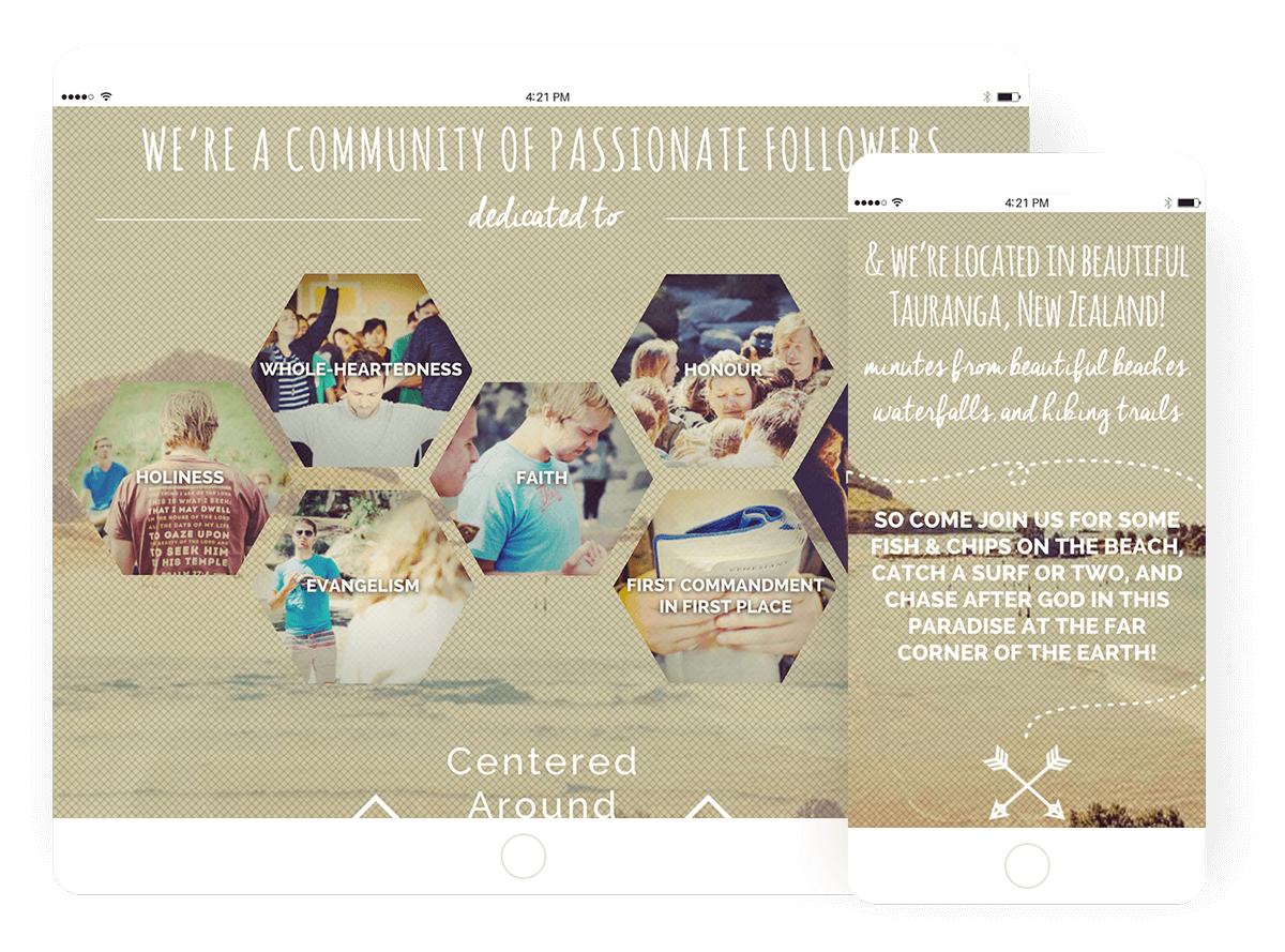
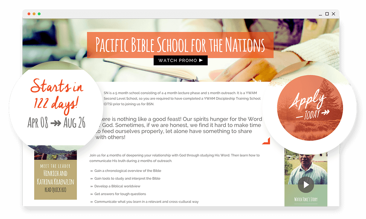
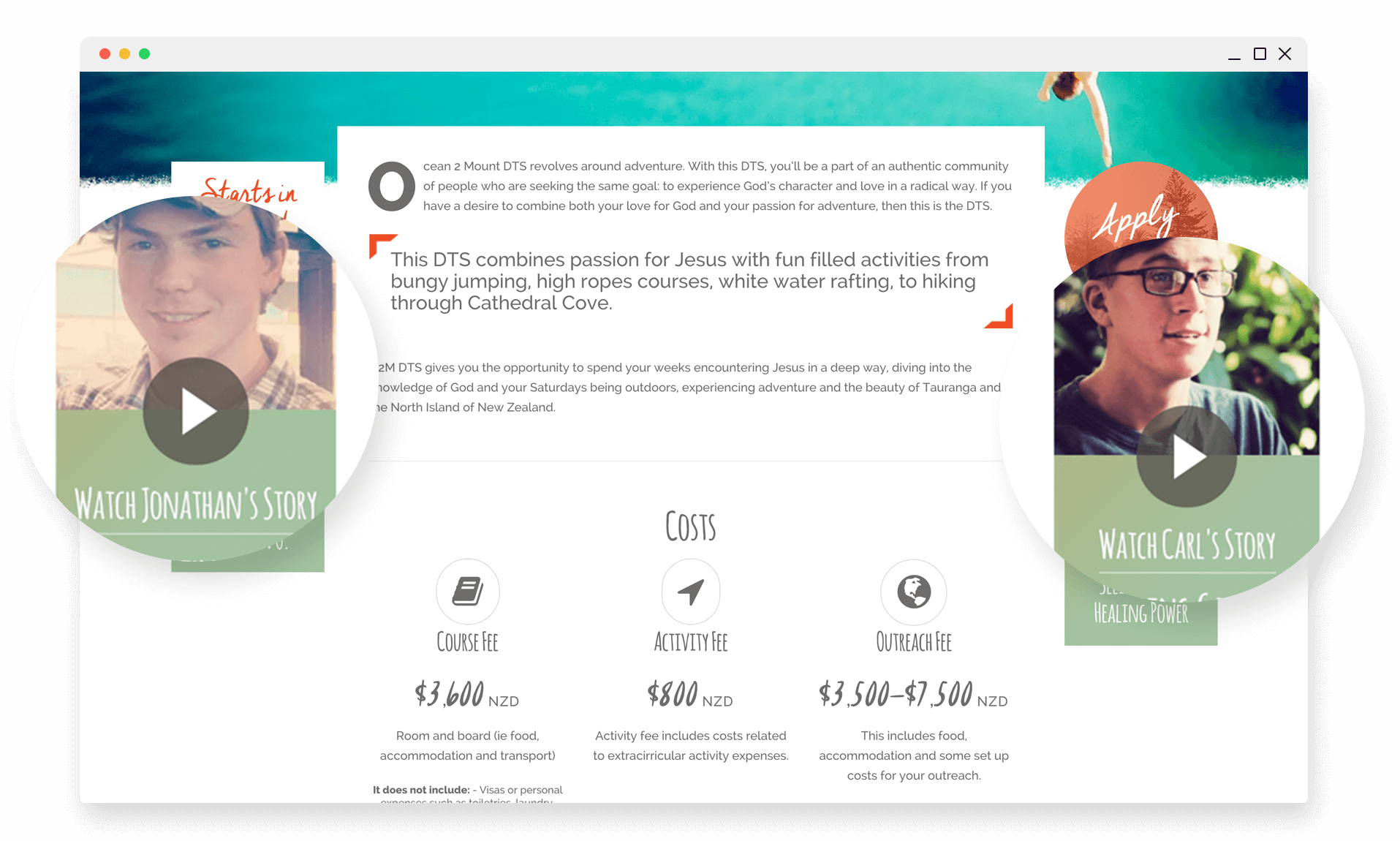
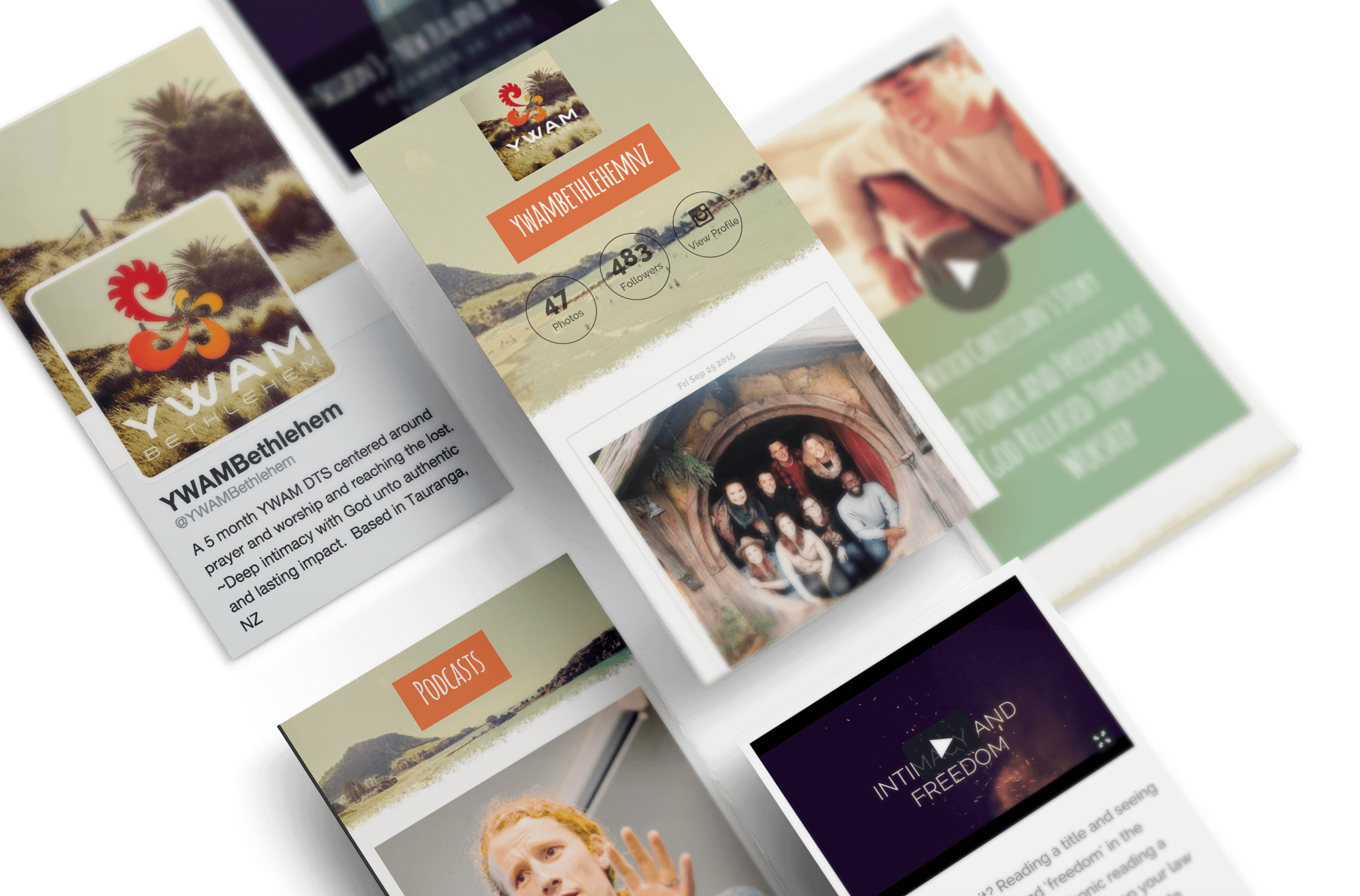
Responsive Wordpress Website Adventure Down in Middle-Earth

for YWAM Bethlehem

After spending several months in New Zealand, I was asked to create an new website for a non-profit missions organization.  The old website was clunky and dated, and the revolving events and schools featured on the site required a more scalable and robust system that was easier to maintain.  After considering all of the content required and creating the design in Photoshop, I was eager to dig my hands into coding a custom website.

Responsive by Design

The old site was 960px wide, a dated site that didn’t account for the various devices used a young adult target demographic.  This was one of the most important aspects of the new site, and making sure everything scaled appropriately was key.  To achieve unique experiences on the varying screen sizes I incorporated Bootstrap as the base for my theme and built up from there.

Starting from the Top

With all of the various schools, events, mission statements, and media on the site, I chose to incorporate a responsive mega-menu to make it easy for visitors to browse and navigate.  Instead of simply adding dull text links I was able to make the menus come to life with images and columns organizing all of the various content.  The menu was also mobile touch friendly, so navigating on small screen sizes was just as easy.

Pushing the Boundaries

CSS3 has opened up a wealth of design opportunities to web designers and developers.  I decided to incorporate a couple of elements like hexagonal grids with background images that represented community and common values into my design.  I wanted to avoid uploading the hexagons as transparent PNG files to save file size and maintain the sharpness of a JPG.  However, there is to hexagonal frame option in CSS, so I had to get creative using rotated boxes with the same image overlapping to form the shape.  

Inspiring Some Action

Every good website has clear calls to action.  I created custom post types for the schools and training events with options for start and end dates.  On the front end I pulled the difference between the current date and start date to build a “Starts in __ days” counter.  On the other side of the page I coded a widget that determined if the page was an entry level, advanced level, or training class and displayed a link to the corresponding application page.  I wanted to encourage users to apply and make it as easy to start as possible.

Telling the Story

The experience of adventure in New Zealand is hard to put into words, so short testimonial videos were the perfect way to tell the story.  I wanted the videos to be relevant to the content of the page while still making the site as dynamic and easy to maintain as possible.  I created a custom testimonial post type and added the option to link the testimonial to a certain page or pages.  Then I created a widget that searches for a testimonial linked to the page.  For pages with the widget in multiple locations I used an array to make sure that duplicates didn’t appear.

Media, Media, Media

Along with videos I also created a blog and podcast section and integrated Vimeo and Instagram feeds so that prospective students could familiarize themselves with the events taking place at the school.  This also made it easy for content to be shared and accessed by friends and family around the world.

For personal and professional reasons, this was one of the most rewarding projects I’ve worked on.  From start to finish I was challenged to push the boundaries of both design and development to create a unique experience of adventure down under.